Monday, 15 December 2008
The analysis of double page spread
This is a double page spread from the Kerrang magazine. The language used in this Kerrang magazine is more straight forward. They have used less slang so that when the older audience buy and read this magazine they can understand it clearly.
The colours used in the article are white, black, green, red and violet.
The style of the texts used in this article is simple and easy to read and they have also used bold texts for the titles.
In this spread there are 11 images which has taken more space on the pages than the text which clearly shows that the target audience are the teenagers who are more attracted to the images than reading long articles. They have also given the images of the individual peesons in the band, which will help the audience to recognise them easily. The bands have been represented in different ways. In one of the images of a band,all of them are wearing suits and are looking really formal and is taken an image as a group. Whereas the other band is represented as entairly different and are given the images of the band as individuals in their own styles. The text starts at the right side of the first page and continues on the left side of the second page.
In the Kerrang magazine they haven’t given any multiple points of entry which gives the audience to choose where to start from. There is just one starting and the audiences have to read the article from the starting as it is the continuation and they have given no choice to choose from where to start the reading.
The analysis of double page spread 1
This is a double page spread in the Q magazine. The language used in this Q magazine double page spread is more conversational. It explains and describes everything in detail and clearly so that the audience understands everything well. Each lines in the spread looks like a conversation. From the language used in this magazine it is clear that the target audience is older and mature people.
The colours used in these pages are mainly white, black and blue.
The style of the text used in the double page spread is simple and easy for the audience to read. They have used italics in some places and also used bold letters for some titles.
They have only used 2 images. They have used more texts than the image which again clearly shows that the audiences are not teenagers who will love to look at the pictures more than the texts. As the target audiences are adults they have included less images and more texts. They have given each image at the top of each page and given the text below the images.
They have given multiple points of entry which gives the audience to choose where to start from. They can read from any different points which they think is more interesting or on which they are more interested on.
Sunday, 14 December 2008
The analysis of questionnaire.
The graph shows the number of males and females who has done my questionnaire. From the graph we can see that 40% were males and 60% were females.
This graph shows which age group I am targeting and also how many people from each group did the questionnaire. Both of the age group did equal amount of questionnaires i.e. 50% from each group.
This is the graph which shows the percentage of people who buy music magazine. Form the 10 people to whom I have given the questionnaires, 90% of them said that they buy music magazines and 10% said that they don’t buy any music magazine.
This is the graph which shows how often they buy the music magazine. From the graph we can see that 10% of the people said that they buy magazine bi-monthly, 20% of them said that they by weekly, 20% said that they buy monthly and 50% said that they buy magazines fortnightly.
This graph shows the percentage of people who like each genres of music. From my questionnaire I made the conclusion that 17% like RnB, 12% like classical, 23% like Rock, 14% like funky house, 14% like hip hop and 20% like pop. As most people like rock i decided to do a rock magazine.
This graph shows how much money they spend on music magazines each month. 11% of the people spend less than £1.00, 11% spend between £6.00- £10.00, 78% spend £1.00- £5.00 and 0% spend more than £10.00. this information helped me to decide to do a magazine which cost between £1 and £5.
I asked my audience if they are more likely to buy a magazine if there is any freebie with that or not. As the graph shows 100% of them said that they are more likely to buy a magazine if there is any freebie.
In my questionnaire I asked my target audience to choose one of the 2 titles for my magazine which is more suitable for a rock magazine. 90% of them said Clangg is better and only 10% said that loud voice is good. This helped me to decide my title for the magazine.
Saturday, 13 December 2008
Friday, 12 December 2008
The mockup of college contents page
Analysis of contents page
This is the contents page of the Clash magazine. The target audience for this bi- monthly magazine is 18-26. The contents is the page is more arranged and the page looks more clear and they have given different titles like features, ones to watch, fashion, recordings etc. they have given particular topics under different titles. They have also given the page numbers like bullet points. They have also given 3 pictures on the left side and a big central image. In this content page everything is in particular order. The Kerrang and NME magazines are entirely different to this magazine as they are more colourful and have different fonts pictures all around the page etc. those magazines are not really ordered in particular order. this magazine focuses on diffrent genres. the layout of the contents page looks like it is targetted on older audience. the main used is of a man who is looking up and has his hands wide open like he is praying. his costume is blue and his face expression shows that he is happy and may be he is thanking god for the happiness he got now.
Analysis of contents pages
This is the content page of Kerrang rock magazine. This page includes the different topics in the magazine which are feedback, news, live reviews, features, K! Icons, album reviews, gigs, swag and famous last words. They have also included the page numbers which they are going to be on. At the top they have given the front page i.e. the magazine logo which shows the dominance and the news about the live show took place in March. At the top right they have given the issue number and the date on which the magazine is issued. They have also given 9 different puffs which have images of some rock bands and stars. They have also given the page number underneath the image and also they have given titles for each of the images and give an idea what they are going to include in those pages. At the bottom right they have given a promoting advert with the images of different Kerrang magazines and below that the have given details about the home delivery for the customers for just £6 per month and the contact details for that. In this content page they have used different images which show that this is a rock magazine. The colours they have used are white, black, red and yellow. They have used similar fonts in both the front and the contents page. In both the pages they have used white, black and red colour which shows the similarity and people can notice that they are from the same magazine. There are no graphical features other than the AC/DC.
The college magazine front cover
Britney Spears analysis
This image is chosen when Britney is grown up and mature. This shows the different side of Britney. This shows that she is no more that young and seducing girl. The use of black and white is significant as it represent the tragedy that happened in Britney’s life in the past such as taking drugs, her children being taken away from her, shaving her hair etc.
The image is a big close up shot which clearly shows her face and the expressions on her face and she is giving direct mode of address. She looks emotional and unhappy in this image. The image clearly shows the readers that she is no more the young teenage girl.
The anchorage text in the front cover says that ‘Britney Spears inside and American tragedy’. The anchorage text and the central image have and clear link with each other. By reading the anchorage text the readers will come to know about the tragedy that took place in Britney’s life. The central image of Britney shows that she is sad and she also wants her audience to know about what she is going through and is having a bad time.
Britney Spears analysis
In the front cover the central image used is a mid shot for this front cover which shows the way she is posing and also shows the body language.
The image has been cropped the image just above the knee which shows her sexy and revealing body. The image is really revealing as this will attract the male audience. They also wanted the readers to focus more on her rather than any other props used in the image.
The costume she uses in this image is just knickers. In this image she is topless and covers her breasts with a white sheet. The costume she is wearing is really sexy and shows that she is young. As she has dressed sexy and revealing she looks innocent and playful.
And the prop she used in this image is a piece of white cloth to hide her breasts.
The setting used for this image is a bedroom and she looks like she is getting ready to go to bed with someone. In the image she looks like she is standing between two walls. She is leaning on to the wall so that she will get covered with the sheet. In this image she is posing in way to contact with the reader. Britney is posing like she wants to have sexual relationship with her audience (reader).
The lighting used for this image is not too bright nor too dark. The lighting is mainly focused on her face and upper part of the body.
The colours used in this image are white, black, blue and red.
Wednesday, 10 December 2008
The Evolution of Britney Spears analysis
RollingStone magazine is a pop magazine. The target audience for this magazine is mainly adults who are over the age of 18. 59% of the readers of this magazine are men and the 41% is women which clearly show that this magazine is mainly focused on men rather than women.
In the mise en scene in the image, the costume is wearing is really sexy which shows that she is young. In this image the costume she is wearing is pink knickers which has black polka dots which shows the girly side of her and also she is wearing a black push up bra which pushes up her breasts and makes her more seductive. She is also wearing a cardigan which shows that she is still a school girl.
They have used a mid shot in which they have cut off her legs which avoided the image being too sexy. They used the mid shot as they wanted the readers to focus more on her rather than any other props used in the image.
The props they have used are the telephone and the teletubbie which shows that she is still young.
The setting they have used is a bed room. The bedroom looks like a man’s bedroom.
The colours they have used are white, black, grey and dark pink.
The inter-textual reference is made to Lolita who is a young girl aged 14 and dresses sexy and is more revealing. This image is really similar to the story of Lolita. And this links that Britney also seduces grown men.
Tuesday, 9 December 2008
AS media magazine cover analysis
The title of the magazine is Mojo. This magazine targets the audience who love classic rock music and also between the ages of 25-45. The title of the magazine is in white colour as white is a sign of peace. The title is placed at the top so that it can be easily seen by the audience when placed on the shelf. The title Mojo means magic charm. The fonts used on the front cover are very simple as it will be easier for the target audience to read. The slogan of the magazine is ‘The music magazine’.
AS media magazine cover analysis
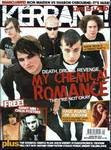
The title of the magazine is Kerrang! The target audience is who love rock music between the ages of 14-20. The title sounds like a sound of guitar when it’s played. The title of the magazine looks like a shattered glass. This looks like it is been hit with something. The two colours mainly used are black and white. The title is placed at the top so that it can be easily seen by the audience when placed on the shelf.
On the bar at the top they have used a strong word ‘war’ to compare the fight between Iron Maiden and Sharon Osbourne. They have used buzz words like free and eggsclusive!.
At the bottom of the page the audience can see list of different bands which are going to be found inside the magazine. They have a range of genre to appeal to a wider audience. This makes it easy for the audience to get different news about which all band groups are inside the magazine.
The Kerrang magazine uses three main colours. They are white, black and red.Young readers are more likely to be influenced by the style and fashion of the bands on the magazine cover.