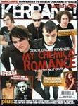
The title of the magazine is Kerrang! The target audience is who love rock music between the ages of 14-20. The title sounds like a sound of guitar when it’s played. The title of the magazine looks like a shattered glass. This looks like it is been hit with something. The two colours mainly used are black and white. The title is placed at the top so that it can be easily seen by the audience when placed on the shelf.
On the bar at the top they have used a strong word ‘war’ to compare the fight between Iron Maiden and Sharon Osbourne. They have used buzz words like free and eggsclusive!.
At the bottom of the page the audience can see list of different bands which are going to be found inside the magazine. They have a range of genre to appeal to a wider audience. This makes it easy for the audience to get different news about which all band groups are inside the magazine.
The Kerrang magazine uses three main colours. They are white, black and red.Young readers are more likely to be influenced by the style and fashion of the bands on the magazine cover.


Some good use of media language and consideration of page layout. What groups are represented here?
ReplyDelete