My target audience is the young people between the age of 16- 25. I have chosen this target audience as they are the people who listen to music more than any other age group and also they will be eager to know new news in the music industry. I also think that this age group are the people who listen to the genre of music which I have chosen to create a magazine. As the people in this age will be eagerly waiting for any news about the new albums and songs which is going to be released and so my magazine will tell the audience what is already out and what is going to be out.
The music magazine I am going to create is a Rock magazine even though I will include some other genres in my magazine such as instrumental and classical. Even though my main focus is on the rock genre for my magazine which will lead having limited amount of audience as my magazine as it is not focusing on other genres such as pop, RnB, funky house etc but I am sure that I will still have a large audience as my target audience listen to rock music the most.
My music magazine is a fortnightly magazine which gives detailed information about the new music launches, the singers, the awards etc. The magazine will cost £2.50. As my target audience are the people between the ages of 16- 21 and most of them won’t be ready to pay more than £5.00 a month. My magazine also has a website from which the audience will get more information about all the topics which was included in the magazine.
My magazine is not going to be glossy as it will cost more for a magazine with glossy papers than the normal papers. For my magazine I will be using paper which is more like newspapers. As the magazine is a fortnightly magazine the cost of production will be higher. I don’t want to make my magazine glossy and increase the price because my target audience are the young people and they won’t pay more than £2.50 for a fortnightly magazine.
Thursday 30 April 2009


Monday 6 April 2009
Evaluation of Project
Evaluation of Project
The music magazine which I have done is a rock magazine called Clanng. In my magazine front cover I have placed the title at the top of the magazine. I have used bigger fonts for the title than other texts in the page which will make the title standout and eye catching for the audience. I have used similar colours in my front cover, contents page and the double page spread which will show the link between the pages. I have used the title as the biggest font and placed at the top because it will be attracted by the audience as when the audience see the magazine the first item they will be noticing will be the title. The title represents the magazine. When the title is placed at the top, it is easy for the people to notice and also can find the title easily especially when it is a new magazine. I have included title, anchorage texts, puffs, slogan, price, graphic features, buzz word, barcode, central and other poster images which make my magazine cover professional. I have used images of different bands and singers on my front cover, contents page and double page spread. I have used same kind of layout through out my magazine. The same colours and the name of the magazine in every page represents that the each page is of the same magazine. The different images of singers, the issue number, the topics and the page numbers etc give the contents page a professional look. I have also included the page numbers of some of the topics on the top left of the images which I have included which will make the audience notice it easily and find their favourite star’s article easily. In my double page spread I have included a main image and also other 2 images of the band. I have included 3 images in my double page spread which appeals more than the article is because my target audience i.e. teenagers will be more attracted towards the images rather than the article. I have also given the name of the band in a large font which the audience will notice easily. I have given an introduction paragraph which includes all the details of the band which will make any audience read the article even if they don’t know about the band. The large image of the band in the front and the double page spread gives the idea that the magazine is focused on this band in special for this issue. The large image also shows the audience who are the people in the band.
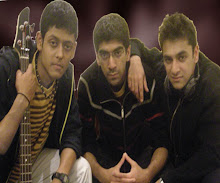
In my magazine cover I have used an Indian rock band which includes 3 teenage boys. The costumes they are wearing are casual and are of colour yellow, black, red and white. This shows that they dress like the normal teenage boys who go to college. The camera shot I have used to take this image is a mid shot. One of them is holding a guitar and another one has a headphone around his neck. This clearly shows their love and passion for music. The image also shows that there is a close relationship between them as they are sitting really close to each other and also one of them is resting his hand on other’s shoulder which only close friends do with each other. Their facial expression is really simple and shows that they are like any other normal guys. 2 of them look a bit serious and one of them looks so simple and is smiling. I have used singers from different ethnicity which shows that my magazine is not ethnic biased. This shows that people form different ethnicity have been included in this magazine.
Before when I actually created my front cover, contents page and my double page spread I looked into different magazines and I also evaluated couple of magazine front covers, contents page and double page spread which gave me a broad idea of how I can create different style in each pages and also I got the idea what to include in each pages. It also helped me in creating layouts for my original magazine. To get familiar with creating the magazine I did a preliminary task which was a college magazine. This helped me to think more about the design, images and the texts which I should be using in my main magazine.
In my front cover I have used a central image and couple of other small images. I have created a unique background by using Photoshop. I also used Photoshop to create some effects in my images and my texts. The central image that I have used is an image of a rock band which consists of 3 teenagers. The costumes they have used are casual.
The target audience for my magazine will be 16-21 year olds. Through the questionnaire I did in the beginning of my research I found out that most of the people in this age love rock music than other types of music. As they are my target audience I have used central image (band) who are of the same age group which will make my audience more attracted. To attract the audience I have used a larger size font for the title which includes graphic features. The colours such as white, black, read and yellow are really attracted by my target audience. The language I have used in the article and throughout the magazine is easy to read. I have also given an introduction paragraph about the band which gives a privilege to the audience who haven’t heard about the band before. I also considered about the shot type, settings and mise en scene of the images that I have taken while taking the image. I have taken a mid shot of the band for the front cover so that the audience can see a good look of the members in the band.
The media institution which I think is suitable for my magazine is Bauer. Bauer is the institution who distributes Kerrang magazine which made me think that Bauer will be the institution which is more suitable for my magazine as my magazine is also a rock magazine which is similar to Kerrang. If an institution like Bauer will help me with the distribution of my Clanng magazine it will give the magazine fame which can lead to good sale. Bauer also helped the Kerrang magazine to start other Medias such as radio, channel etc. which made me think that Bauer is the right institution for me as it might help me to reach the level as the Kerrang magazine is now. Later on I would be also able to start other medias like radio, channels etc. I think Bauer needs a rock magazine like mine as well as my magazine gives the news about diverse race and ethnicity. In my magazine I have included more about the Asian bands and the artists which is not found in other magazines which will make the institution to cover a wide range of audience.
By creating my magazine I got the broad idea of how to create a proper magazine and also the important points which should be taken into account while creating it. I have also understood the importance of the images and the shots in which they have taken. I have also understood the long procedures which is included in the sale of a magazine. Such as designing the magazine, gathering in formations which can be included in the magazine such as interviews reviews etc, the distribution and the sale.
The music magazine which I have done is a rock magazine called Clanng. In my magazine front cover I have placed the title at the top of the magazine. I have used bigger fonts for the title than other texts in the page which will make the title standout and eye catching for the audience. I have used similar colours in my front cover, contents page and the double page spread which will show the link between the pages. I have used the title as the biggest font and placed at the top because it will be attracted by the audience as when the audience see the magazine the first item they will be noticing will be the title. The title represents the magazine. When the title is placed at the top, it is easy for the people to notice and also can find the title easily especially when it is a new magazine. I have included title, anchorage texts, puffs, slogan, price, graphic features, buzz word, barcode, central and other poster images which make my magazine cover professional. I have used images of different bands and singers on my front cover, contents page and double page spread. I have used same kind of layout through out my magazine. The same colours and the name of the magazine in every page represents that the each page is of the same magazine. The different images of singers, the issue number, the topics and the page numbers etc give the contents page a professional look. I have also included the page numbers of some of the topics on the top left of the images which I have included which will make the audience notice it easily and find their favourite star’s article easily. In my double page spread I have included a main image and also other 2 images of the band. I have included 3 images in my double page spread which appeals more than the article is because my target audience i.e. teenagers will be more attracted towards the images rather than the article. I have also given the name of the band in a large font which the audience will notice easily. I have given an introduction paragraph which includes all the details of the band which will make any audience read the article even if they don’t know about the band. The large image of the band in the front and the double page spread gives the idea that the magazine is focused on this band in special for this issue. The large image also shows the audience who are the people in the band.
In my magazine cover I have used an Indian rock band which includes 3 teenage boys. The costumes they are wearing are casual and are of colour yellow, black, red and white. This shows that they dress like the normal teenage boys who go to college. The camera shot I have used to take this image is a mid shot. One of them is holding a guitar and another one has a headphone around his neck. This clearly shows their love and passion for music. The image also shows that there is a close relationship between them as they are sitting really close to each other and also one of them is resting his hand on other’s shoulder which only close friends do with each other. Their facial expression is really simple and shows that they are like any other normal guys. 2 of them look a bit serious and one of them looks so simple and is smiling. I have used singers from different ethnicity which shows that my magazine is not ethnic biased. This shows that people form different ethnicity have been included in this magazine.
Before when I actually created my front cover, contents page and my double page spread I looked into different magazines and I also evaluated couple of magazine front covers, contents page and double page spread which gave me a broad idea of how I can create different style in each pages and also I got the idea what to include in each pages. It also helped me in creating layouts for my original magazine. To get familiar with creating the magazine I did a preliminary task which was a college magazine. This helped me to think more about the design, images and the texts which I should be using in my main magazine.
In my front cover I have used a central image and couple of other small images. I have created a unique background by using Photoshop. I also used Photoshop to create some effects in my images and my texts. The central image that I have used is an image of a rock band which consists of 3 teenagers. The costumes they have used are casual.
The target audience for my magazine will be 16-21 year olds. Through the questionnaire I did in the beginning of my research I found out that most of the people in this age love rock music than other types of music. As they are my target audience I have used central image (band) who are of the same age group which will make my audience more attracted. To attract the audience I have used a larger size font for the title which includes graphic features. The colours such as white, black, read and yellow are really attracted by my target audience. The language I have used in the article and throughout the magazine is easy to read. I have also given an introduction paragraph about the band which gives a privilege to the audience who haven’t heard about the band before. I also considered about the shot type, settings and mise en scene of the images that I have taken while taking the image. I have taken a mid shot of the band for the front cover so that the audience can see a good look of the members in the band.
The media institution which I think is suitable for my magazine is Bauer. Bauer is the institution who distributes Kerrang magazine which made me think that Bauer will be the institution which is more suitable for my magazine as my magazine is also a rock magazine which is similar to Kerrang. If an institution like Bauer will help me with the distribution of my Clanng magazine it will give the magazine fame which can lead to good sale. Bauer also helped the Kerrang magazine to start other Medias such as radio, channel etc. which made me think that Bauer is the right institution for me as it might help me to reach the level as the Kerrang magazine is now. Later on I would be also able to start other medias like radio, channels etc. I think Bauer needs a rock magazine like mine as well as my magazine gives the news about diverse race and ethnicity. In my magazine I have included more about the Asian bands and the artists which is not found in other magazines which will make the institution to cover a wide range of audience.
By creating my magazine I got the broad idea of how to create a proper magazine and also the important points which should be taken into account while creating it. I have also understood the importance of the images and the shots in which they have taken. I have also understood the long procedures which is included in the sale of a magazine. Such as designing the magazine, gathering in formations which can be included in the magazine such as interviews reviews etc, the distribution and the sale.
Friday 3 April 2009


Thursday 2 April 2009


Tuesday 6 January 2009


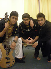
My first draft of magazine cover.

This is the first draft for my magazine cover. I decided to change this cover because the image that i have taken was more suitable for a hip hop magazine rather than a rock magazine.
I am going to change the fonts and the colours used on the cover which will make the cover look more like a rock magazine and attractive as well.
I am also planning to include a bar code at the bottom of the page and also some puffs.
Monday 15 December 2008
The analysis of double page spread

This is a double page spread from the Kerrang magazine. The language used in this Kerrang magazine is more straight forward. They have used less slang so that when the older audience buy and read this magazine they can understand it clearly.
The colours used in the article are white, black, green, red and violet.
The style of the texts used in this article is simple and easy to read and they have also used bold texts for the titles.
In this spread there are 11 images which has taken more space on the pages than the text which clearly shows that the target audience are the teenagers who are more attracted to the images than reading long articles. They have also given the images of the individual peesons in the band, which will help the audience to recognise them easily. The bands have been represented in different ways. In one of the images of a band,all of them are wearing suits and are looking really formal and is taken an image as a group. Whereas the other band is represented as entairly different and are given the images of the band as individuals in their own styles. The text starts at the right side of the first page and continues on the left side of the second page.
In the Kerrang magazine they haven’t given any multiple points of entry which gives the audience to choose where to start from. There is just one starting and the audiences have to read the article from the starting as it is the continuation and they have given no choice to choose from where to start the reading.
The analysis of double page spread 1

This is a double page spread in the Q magazine. The language used in this Q magazine double page spread is more conversational. It explains and describes everything in detail and clearly so that the audience understands everything well. Each lines in the spread looks like a conversation. From the language used in this magazine it is clear that the target audience is older and mature people.
The colours used in these pages are mainly white, black and blue.
The style of the text used in the double page spread is simple and easy for the audience to read. They have used italics in some places and also used bold letters for some titles.
They have only used 2 images. They have used more texts than the image which again clearly shows that the audiences are not teenagers who will love to look at the pictures more than the texts. As the target audiences are adults they have included less images and more texts. They have given each image at the top of each page and given the text below the images.
They have given multiple points of entry which gives the audience to choose where to start from. They can read from any different points which they think is more interesting or on which they are more interested on.
Sunday 14 December 2008
The analysis of questionnaire.

The graph shows the number of males and females who has done my questionnaire. From the graph we can see that 40% were males and 60% were females.

This graph shows which age group I am targeting and also how many people from each group did the questionnaire. Both of the age group did equal amount of questionnaires i.e. 50% from each group.

This is the graph which shows the percentage of people who buy music magazine. Form the 10 people to whom I have given the questionnaires, 90% of them said that they buy music magazines and 10% said that they don’t buy any music magazine.

This is the graph which shows how often they buy the music magazine. From the graph we can see that 10% of the people said that they buy magazine bi-monthly, 20% of them said that they by weekly, 20% said that they buy monthly and 50% said that they buy magazines fortnightly.

This graph shows the percentage of people who like each genres of music. From my questionnaire I made the conclusion that 17% like RnB, 12% like classical, 23% like Rock, 14% like funky house, 14% like hip hop and 20% like pop. As most people like rock i decided to do a rock magazine.

This graph shows how much money they spend on music magazines each month. 11% of the people spend less than £1.00, 11% spend between £6.00- £10.00, 78% spend £1.00- £5.00 and 0% spend more than £10.00. this information helped me to decide to do a magazine which cost between £1 and £5.

I asked my audience if they are more likely to buy a magazine if there is any freebie with that or not. As the graph shows 100% of them said that they are more likely to buy a magazine if there is any freebie.

In my questionnaire I asked my target audience to choose one of the 2 titles for my magazine which is more suitable for a rock magazine. 90% of them said Clangg is better and only 10% said that loud voice is good. This helped me to decide my title for the magazine.
Saturday 13 December 2008


Friday 12 December 2008

Subscribe to:
Posts (Atom)